Post by Janice Dickinson on Apr 3, 2013 9:12:01 GMT -5
This round, we challenged you with magazine covers. We were judging you on fashion, modelling, execution and the overall appeal to the customer. Here are your photos.
Team 90210:
Amber:

Naomi

Kiera:

Team Nordic:
Alexander:

Zac:

Danny:

Team 90210:
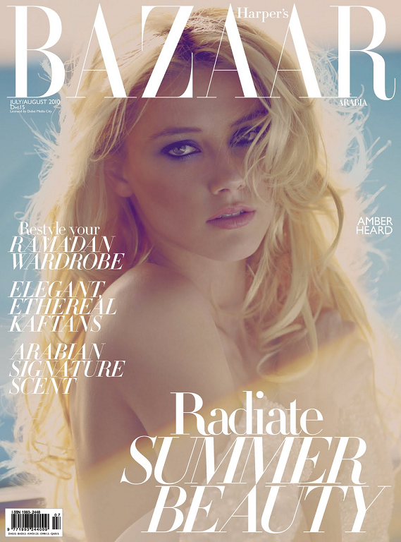
Amber:

Janice: What I like about this is how soft it is, especially when we compare to
the bright, vibrant side of Amber you have shown us before. You make
beauty shots look effortlessly easy here too, when they're painfully
hard. The lighting is obscuring our view of your fashion though, and
that's disappointing.
Morgan: Hello angelic princess. What I like about this photo is the raw beauty
that you have shines through, the emotion and the simplicity would
appeal to a lot of female buyers. The light streaming in fades out half
of your body making your limbs and torso blend into one another which is
a bit distracting. Overall I think your face is a gorgeous shot.
Tiny Tina: The light, airy focus of the shot is complimenting the feel of yo shot.
Yo makeup is nice the eyeliner and mascara is highlighting yo eyes very
well, girl. All aspects of yo photo come together to provide one
coherent and complete vision fo yo cover and I'm really likin' what you
doin' here.
Team Brit 2.0: the bright, vibrant side of Amber you have shown us before. You make
beauty shots look effortlessly easy here too, when they're painfully
hard. The lighting is obscuring our view of your fashion though, and
that's disappointing.
that you have shines through, the emotion and the simplicity would
appeal to a lot of female buyers. The light streaming in fades out half
of your body making your limbs and torso blend into one another which is
a bit distracting. Overall I think your face is a gorgeous shot.
Yo makeup is nice the eyeliner and mascara is highlighting yo eyes very
well, girl. All aspects of yo photo come together to provide one
coherent and complete vision fo yo cover and I'm really likin' what you
doin' here.
Naomi

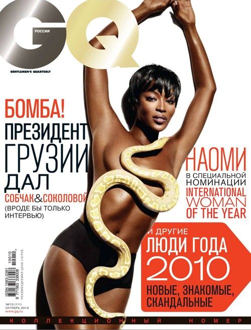
Janice: First thing's first, I love the body, and the pose, it's amazing. I love
the snake, and the whole cover is very eyecatching, and definitely
would sell. But I don't like the hair on Naomi. Or her face, it's quite
blah to me. I also would have liked to see more fashion.
Morgan: Girl you look like a sultry mermaid here, that has unfortunately come
across a snake which is coincidently covering all of the wrong places.
You wait till I get my hands on that damn snake! I told Janice ages ago I
wanted it off the set! Like Janice, I enjoy your body modelling you
look graciously tall here even though your legs are barely showing but
your facial modelling brings you up short. Your left eye looks puffy and
swollen and there seems to be a lack of emotion radiating from your
face.
Tiny Tina: Damn girl, yo body is rockin' and I is loving yo posin'! You got some
very creative use of the snake goin' on there, too. I don't really like
yo face here, though; it's lookin' a little blank. The rest of yo cover
is really strong, though. Good job, girl
Euro Girls:the snake, and the whole cover is very eyecatching, and definitely
would sell. But I don't like the hair on Naomi. Or her face, it's quite
blah to me. I also would have liked to see more fashion.
across a snake which is coincidently covering all of the wrong places.
You wait till I get my hands on that damn snake! I told Janice ages ago I
wanted it off the set! Like Janice, I enjoy your body modelling you
look graciously tall here even though your legs are barely showing but
your facial modelling brings you up short. Your left eye looks puffy and
swollen and there seems to be a lack of emotion radiating from your
face.
Tiny Tina: Damn girl, yo body is rockin' and I is loving yo posin'! You got some
very creative use of the snake goin' on there, too. I don't really like
yo face here, though; it's lookin' a little blank. The rest of yo cover
is really strong, though. Good job, girl

Kiera:

Janice: Keira's features are striking. Strong cheekbones, strong jaw, lips,
brows, she's got it all. The cover has intensity and would pull a
potential reader in. We can see a little bit of fashion in the cover,
but not a lot. Still, we have a strong face pulling us in.
Morgan: Girl your makeup artist is a superstar because you have got some razor
sharp cheekbones here! You look marvellously different here which is an
important attribute to have as a model, it shows us that you can pull
off different looks. I like the unwavering eye contact, the raised
eyebrow and look at that forehead! A strong shot from you which
showcases the positive effects that can stem from powerful face
modelling.
Tiny Tina: Ooooooohhh... those lines.... they... so... DOPE YO! I'm lovin yo
stylin' here and the really sleeked back look. I love the strong lines
you giving us here cause the dark makeup and styling really emphasizes
everything. Loving the drama you giving us this round.
brows, she's got it all. The cover has intensity and would pull a
potential reader in. We can see a little bit of fashion in the cover,
but not a lot. Still, we have a strong face pulling us in.
Morgan: Girl your makeup artist is a superstar because you have got some razor
sharp cheekbones here! You look marvellously different here which is an
important attribute to have as a model, it shows us that you can pull
off different looks. I like the unwavering eye contact, the raised
eyebrow and look at that forehead! A strong shot from you which
showcases the positive effects that can stem from powerful face
modelling.
stylin' here and the really sleeked back look. I love the strong lines
you giving us here cause the dark makeup and styling really emphasizes
everything. Loving the drama you giving us this round.
Team Nordic:
Alexander:

Janice: Strong eye contact here. With a handsome man staring at them, it's sure
to draw in potential female and homosexual male readers. Alexander looks
rugged, but at the same time worn down. He looks raw and natural, but
that makes him look tired. Still, he can look strong while tired, and
that's a huge plus. A fashionable appeal is lacking though.
Morgan: Someone has been in a sweaty rave party! Luckily this works for you
here, and doesn't look like a "I am unfit and rode my bike for 5 minutes
and this is the result" rather it looks sexy and gives the impression
that you are somewhat superhuman. Eye connectivity is very intense and
I'm liking that we are getting a nice close up shot of you, it brings
attention to the model quality features of your face.
Tiny Tina: Wow boo, this is sexy. as. hell! Yo eyes are phenomenal and I'm loving
the way yo hair is styled. I love facial hair on guys and you have the
perfect amount. This magazine cover would definitely make me stop and
take a look.
SuperModels: to draw in potential female and homosexual male readers. Alexander looks
rugged, but at the same time worn down. He looks raw and natural, but
that makes him look tired. Still, he can look strong while tired, and
that's a huge plus. A fashionable appeal is lacking though.
Morgan: Someone has been in a sweaty rave party! Luckily this works for you
here, and doesn't look like a "I am unfit and rode my bike for 5 minutes
and this is the result" rather it looks sexy and gives the impression
that you are somewhat superhuman. Eye connectivity is very intense and
I'm liking that we are getting a nice close up shot of you, it brings
attention to the model quality features of your face.
the way yo hair is styled. I love facial hair on guys and you have the
perfect amount. This magazine cover would definitely make me stop and
take a look.
Zac:

Janice: No sexy Eugen? Oh, I suppose Zac will do. First thing that stands out to
me here is that we have a magazine with fashion content. I wish the
modelling pose was stronger, but it's still very good and angular. The
face could be stronger though. Either more intense, or softer. This one
is somewhere in between.
Morgan: I am enjoying the fashion aspect of this photo, like Janice. You seem
able to pull off any outfit! However I'm not liking how you look stiff
and uncomfortable in your posing. It looks like someone has given you
these rabbits at the last second and you are trying to give us an "I am
okay with this" face rather than actual emotion and connectivity.
Tiny Tina: I don't think you lookin' too stiff here. I think you giving us a proper
pose with proper posture given how you dressed fo' us. The bunnies
coming out yo' suit help keep this picture from being too serious. I
like that you serious with a little fun element being added. It's how I
think GQ should handle a more light-hearted cover.
Team Teenage Dream: me here is that we have a magazine with fashion content. I wish the
modelling pose was stronger, but it's still very good and angular. The
face could be stronger though. Either more intense, or softer. This one
is somewhere in between.
Morgan: I am enjoying the fashion aspect of this photo, like Janice. You seem
able to pull off any outfit! However I'm not liking how you look stiff
and uncomfortable in your posing. It looks like someone has given you
these rabbits at the last second and you are trying to give us an "I am
okay with this" face rather than actual emotion and connectivity.
Tiny Tina: I don't think you lookin' too stiff here. I think you giving us a proper
pose with proper posture given how you dressed fo' us. The bunnies
coming out yo' suit help keep this picture from being too serious. I
like that you serious with a little fun element being added. It's how I
think GQ should handle a more light-hearted cover.
Danny:

Janice: A very sexy smoulder from Danny Shwarz. His sexy features would
definitely catch the attention of the target audience: The fashionable
gay man. A strong jaw, brow and cheekbones, it's a good, effortless
beauty shot. There's a little bit of a fashion tang too.
Morgan: Sounds like Janice is trying to say "I am searching for this magazine
cover in real life at this second to add to my viewing collection!" You
do have lovely facial definitions which stand out here, and your whole
face is radiating with intensity which I like. The presence of your
hands making a shape out of your shirt help to create fashion, I just
wish that your right hand didn't look like a potato.
Tiny Tina: Yo face just looks perfect here; such clear skin. Yo hair is lookin'
nice, too. At first, I didn't really like the "clothing" but after
reading the text and seeing that it was the swimsuit edition, it makes
complete sense.
definitely catch the attention of the target audience: The fashionable
gay man. A strong jaw, brow and cheekbones, it's a good, effortless
beauty shot. There's a little bit of a fashion tang too.
cover in real life at this second to add to my viewing collection!" You
do have lovely facial definitions which stand out here, and your whole
face is radiating with intensity which I like. The presence of your
hands making a shape out of your shirt help to create fashion, I just
wish that your right hand didn't look like a potato.
nice, too. At first, I didn't really like the "clothing" but after
reading the text and seeing that it was the swimsuit edition, it makes
complete sense.
White Chicks:
Miranda:

Miranda:

Janice: The pose is great, but that hair style does not do Miranda any favours. I
don't think it's a good angle for the face either. Nevertheless, the
face does look young, and European. I want to say French. And the
fashion. Well that's just flawlessly amazing.
Morgan: Miranda every time I see you, you look like a porcelain doll with
strangely acrylic and pastel features! I want to know that you are a
real woman! However this shot is divine, I see fashion, a strong pose,
angles, neck, careful body positioning. My only suggestion for
improvement is to open your eyes up a bit more or connect them to the
camera to make them look larger.
Tiny Tina: You got you a really nice pose going on here and the dress is lookin'
nice, too. I definitely get the Vogue vibe from this photo. I like the
way the dress is complimenting yo eyes, too. Had it not done so, I think
it would have made yo eyes harder ta notice.
don't think it's a good angle for the face either. Nevertheless, the
face does look young, and European. I want to say French. And the
fashion. Well that's just flawlessly amazing.
Morgan: Miranda every time I see you, you look like a porcelain doll with
strangely acrylic and pastel features! I want to know that you are a
real woman! However this shot is divine, I see fashion, a strong pose,
angles, neck, careful body positioning. My only suggestion for
improvement is to open your eyes up a bit more or connect them to the
camera to make them look larger.
nice, too. I definitely get the Vogue vibe from this photo. I like the
way the dress is complimenting yo eyes, too. Had it not done so, I think
it would have made yo eyes harder ta notice.


