Post by Scream Team on Dec 4, 2012 14:27:37 GMT -5
Rick Genest - Cologne
Name of Cologne -->

Let's be honest, there is little to no modelyness here...which is exactly what I'm going for. The type of people that would buy
Rick is known throughout the model world because of his tattoos and eccentric poses, not because he looks like the rest of the male model industry. Rick isn't afraid of being different and neither should the cologne he endorses.
Odd One Out - It's okay to be
The tagline heavily incorporates the pose that Rick is doing...i.e the "okay" hand gestures. For this cologne, the "okay" hand gesture would be its statement pose, signaling that it's okay to be different.
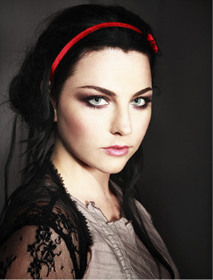
Amy Lee - Eye Shadow

My attention went right to Amy's eyes, which is exactly what I'd be looking for in an eye shadow ad. Often times Amy is associated with edgey hard rock looks, but this photo shows a different side to Amy.
Ultima can help create another you, if you dare. (tagline)
Jack Skellington - Contact Lenses

I actually found a fan pic where the creator gave him glowing eyes!
The interesting aspect about this photo is you get a two for one. Not only do Jack's eyes glow but so do the bat's eyes! The customer is presented with two possible options for their glow-in-the-dark contact needs.
When I go out for a night on the town, my eyes are always drawn to the eyes of others. But when it's so dark, you can't tell who is looking where. Glow-in-the-dark not only show you who is looking at you, but it lets you make others aware that you're glaring right back! It's all the rave! (yes I'm making a pun about glowsticks and raves)
Glow in the dark contacts, when being noticed in the light isn't enough. (tagline)
Product Photos
(in case I needed them)
cologne photo

(ralph lauren purple label)
It would be cool if the cologne was placed in the direction of where Rick was looking (i.e. top right) - just a suggestion
Eye shadow

(any gray would work, unless you think of something better?)
Contact Lens

(any glow in the dark lens would do)
Also for the photoshopped ad, it would be pretty cool if it looked like Jack was holding the product between his hands but like hovering it...not really touching it. It would be as if he was using magic to hold it up...since he is the Master of Fright. [/center][/font]
(Note: I didn't know if I needed to create my own tagline, or if I used the ones you already had...so I just made my own in case lol. Also I added product images, but you don't have to stick with them obviously...they were just suggestions to help you out...same with the photoshop ad ideas!
I'm not trying to be picky, just trying to help you guys out. Photoshop can't be easy lol.
Also, this photoshoot was pretty fun!)


