Post by Janice Dickinson on Dec 3, 2012 8:14:40 GMT -5
Eastern and Western elements combined this week. But first of all, I will announce I have brought a consolation prize for each team (Well, three teams, because I couldn't find anything good for two of them at the shop I was at.) Each top 5 team will now receive a prize. But the top three will receive an extra prize.
Let's go to panel.
Blonde Ambition:
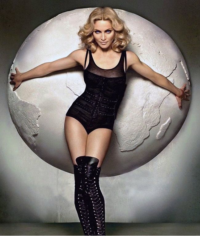
Madonna portraying Eastern Earth
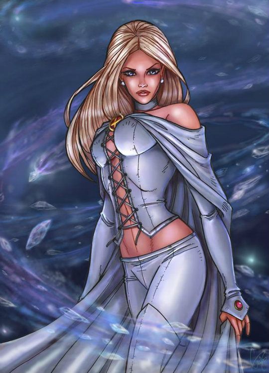
Emma Frost portraying Western Aether:
Morgan: Madonna - Now this gives a new meaning to the saying "carrying the world on your shoulders." I love how obvious the element is reflected within your photo and your modelling is up front and the center of attention, so this photo is strong in two respects. The only slight criticism I would have is the facial expression is just a tad off for me, your eyes look squinted which makes it hard to read your emotion. But its a minor criticism.
Emma - This is also a good representation of your element. This photo looks situated in space, and the backdrop gives a very fluid and dynamic feel. I like the strong presence of your modelling, you have a great connection with the camera and the flowing of your clothes connects you with the environment of the photo. Good job!
Janice: I enjoy the literal "EARTH" of your Earthy picture. But I also love the hidden undertones of the representation of balance, stability and protectiveness. Though the face is strong, it does come off as a little bit old.
Meanwhile, Emma's representation of the little known element of Aether is simply sublime. There modelling presence is amazing, there's a lot of power, and the backdrop is amazing.
Toadette: Madonna: I think this is a great photo representing earth. The use of the prop is perfect, and your styling is great, because you look like a model! I am not in love with your eyes here, either, but this is the perfect photo otherwise, so it's okay.
Emma: I really like this too. It looks wintry at first, but I definitely get the celestial feel of it. The modelling and styling are perfect... so great job!
Team Fantabulous:
Kagome representing Eastern Water:

Sonam representing Western Earth:

Janice: It's a shame that first picture wasn't Kagome, because it was a very interesting picture. But I feel that despite the lower modelling and fashion content, it fits the theme very nicely, displaying wisdom, deep reflectiveness and pliancy, plus the literal rain adds in nicely.
Meanwhile, Sonam's face is very strong here, but I feel the blanched theme of this picture brings it down a notch. I'm not going to deduct points. Your face is striking, and the background is gorgeous, but I feel the composition and the lighting really take away the appeal.
Morgan: Kagome - I can see the connection with the element water which is pleasing and your description gives us a different perspective to see this photo from which I appreciate. Although your modelling can be interpreted as wise, soft etc it comes across as void of emotion and too safe.
Sonam - I like the lush earth environment in this photo the trees, sunny skies, mountains and even some wood elements. I like the clarity of your face and the strong facial expression. The shadow on the left side of your face near your eye combines some of your facial features, but its a minor minor flaw.
Toadette: Kagome: While I think this photo has a good relation to the theme, I am struggling to see a model here. If she wasn't just sitting there, I'd like this photo a lot more.
Sonam: I do like this photo in some regards, like the backdrop and the model that I see. I sort of wish the bars in front of your face weren't there, but it's not a huge deal. What I don't like is the lighting... it doesn't do you any justice!
Team India:
Shilpa representing Eastern Wood:

Mehreen representing Western Water:

Morgan: Shilpa - This is a very natural representation of you yourself as a model and the element wood. I like the color connection, and your appearance itself. The only thing missing from this photo is something that will set your photo apart from the rest. Because ths is such a natural, simple representation it may be considered too safe.
Mehreen - I'm feeling the need to cool off after seeing this. This photo has an obvious connection with water as you are immersing yourself in the watery goodness with beads of water dripping off you. What I also like is the mysterious, strong, endearing vibe you are giving off.
Janice: Well, I do think Morgan is right here, I do feel Shilpa's photo is safe. However, the Earthy tones and the wood backdrop give it a woody feel. Unfortunately, there isn't a lot to set it apart from the rest. It's a gorgeous beauty shot that sells a lot of jewellery, so that will boost you up in the modelling and fashion departments, and that's about it.
Mehreen on the other hand, her photo is beautiful, and connects well to the theme in the literal way. But I feel the picture could have been a lot better with a bit more neck, or less editing. The head looks out of place.
Toadette: Shilpa: I don't have much to add from the other judges. While there is a direct correlation to theme, I feel it is much too safe.
Mehreen: I really like this, but I guess it just isn't blowing me away. Maybe I am in the mood for something more artistic? The water is there and you look like a model. So I guess it's a little safe too, but better than Shilpa.
International Beauties:
Makoto representing Western Wind:

Katie representing Eastern Fire:

Morgan: Makoto - Ahh a return of a good photo used in a different way, and I like this execution. This photo has a great connection to wind with the swirling leaves, powerful elements that the wind is stirring up and you caught up in the environment. I like the way you look so shy and yet so graceful with your body and modelling.
Katie - First off this photo does need to be bigger. I like the modelling in this photo, your stance is strong and reveals a lot of emotion and your description illustrates well what this emotion could be labelled as. The fire lit candles in the background look like more of a prop and afterthought than representing the element of fire. This photo is okay but doesnt have the same impact as Makoto's does.
Janice: Janice: It's a shame you couldn't get a hold of Wood, because Sailor Jupiter is the soldier of wood after all. But your representation of Air is beautiful. There are a lot of things that are associated with the air, such as the weather, and that's where the lightning comes in. The face is also great, it's a sexy over the shoulder gaze.
A very quick google search using the image URL could have found you a bigger image in seconds. To your advantage, the small image size makes it look like the eyes are closed at first glance, which is good, but on closer inspection, the eyes are dull and lifeless. The photo's stance and ambiance are powerful, but it is brought down by the face, and the size.
Toadette: Makoto: I think this is great! While normally I like to see face, this photo works really well. The air element is clear, and I see a model here. Great job!
Katie: Bigger plz. This is definitely brought down by size, and because it's small, darkness as well. It's sort of hard to make out parts of the photo. The fire element is there, and I like the candle interpretation. I also see a model (when I look closely). Overall it's not a bad job, but if it were bigger it'd be a lot better!
Scream Team:
Rick representing Eastern Metal:

Jack representing Western Fire:

Morgan: Rick - This is a very unique representation of metal and I like it. When I think of metal I think of cold, smooth and dark colours and that is exactly what is represented in this photo. Your modelling portrays a vibe of being unfeeling, static and rusted which I love. Your fashion sense depicts the stereotype of metal also. I like what you have done here and the angle you have approached this photoshoot from.
Jack - EVIL! And fiery, this photo is a much better submission than the ambiguous Jack that you posted previously. I love the mischievous, smoking and yet compelling feel to this photo. Your smile tells a million stories and I am surprised at the quality of emotion you are displaying. The fire in the pumpkins, in your expression and the smoky, blurred background makes a great connection to fire.
Janice: This is a very masculine, metallic image, and the use of monochromatic greyscale (Fancy for black and white) makes it stronger. I can also make the connection to metal music as your description says. It's heavily inspired by the metal element.
Lastly, I am very happy you found this picture to replace the ambiguous not-jack you submitted earlier. This really explores the dark side of fire, in the vengefulness, the mischievousness and the potency for destruction. It's breathtaking to the eye, but from a fashion perspective, it's hard to tell.
Toadette: Rick: I definitely see the element of metal here, but there's no shock factor. This is something we would expect from you, but that's really my only criticism. It's good to stay true to who you are, but some shock value would really be nice.
Jack: I really like this photo of Jack. I see the fire with the jack-o-lanterns, and the fire in his eyes. I also can see a model here for the first time with Jack! Good job.
Let's go to panel.
Blonde Ambition:
Madonna portraying Eastern Earth

Emma Frost portraying Western Aether:

Morgan: Madonna - Now this gives a new meaning to the saying "carrying the world on your shoulders." I love how obvious the element is reflected within your photo and your modelling is up front and the center of attention, so this photo is strong in two respects. The only slight criticism I would have is the facial expression is just a tad off for me, your eyes look squinted which makes it hard to read your emotion. But its a minor criticism.
Emma - This is also a good representation of your element. This photo looks situated in space, and the backdrop gives a very fluid and dynamic feel. I like the strong presence of your modelling, you have a great connection with the camera and the flowing of your clothes connects you with the environment of the photo. Good job!
Janice: I enjoy the literal "EARTH" of your Earthy picture. But I also love the hidden undertones of the representation of balance, stability and protectiveness. Though the face is strong, it does come off as a little bit old.
Meanwhile, Emma's representation of the little known element of Aether is simply sublime. There modelling presence is amazing, there's a lot of power, and the backdrop is amazing.
Toadette: Madonna: I think this is a great photo representing earth. The use of the prop is perfect, and your styling is great, because you look like a model! I am not in love with your eyes here, either, but this is the perfect photo otherwise, so it's okay.
Emma: I really like this too. It looks wintry at first, but I definitely get the celestial feel of it. The modelling and styling are perfect... so great job!
Team Fantabulous:
Kagome representing Eastern Water:

Sonam representing Western Earth:

Janice: It's a shame that first picture wasn't Kagome, because it was a very interesting picture. But I feel that despite the lower modelling and fashion content, it fits the theme very nicely, displaying wisdom, deep reflectiveness and pliancy, plus the literal rain adds in nicely.
Meanwhile, Sonam's face is very strong here, but I feel the blanched theme of this picture brings it down a notch. I'm not going to deduct points. Your face is striking, and the background is gorgeous, but I feel the composition and the lighting really take away the appeal.
Morgan: Kagome - I can see the connection with the element water which is pleasing and your description gives us a different perspective to see this photo from which I appreciate. Although your modelling can be interpreted as wise, soft etc it comes across as void of emotion and too safe.
Sonam - I like the lush earth environment in this photo the trees, sunny skies, mountains and even some wood elements. I like the clarity of your face and the strong facial expression. The shadow on the left side of your face near your eye combines some of your facial features, but its a minor minor flaw.
Toadette: Kagome: While I think this photo has a good relation to the theme, I am struggling to see a model here. If she wasn't just sitting there, I'd like this photo a lot more.
Sonam: I do like this photo in some regards, like the backdrop and the model that I see. I sort of wish the bars in front of your face weren't there, but it's not a huge deal. What I don't like is the lighting... it doesn't do you any justice!
Team India:
Shilpa representing Eastern Wood:

Mehreen representing Western Water:

Morgan: Shilpa - This is a very natural representation of you yourself as a model and the element wood. I like the color connection, and your appearance itself. The only thing missing from this photo is something that will set your photo apart from the rest. Because ths is such a natural, simple representation it may be considered too safe.
Mehreen - I'm feeling the need to cool off after seeing this. This photo has an obvious connection with water as you are immersing yourself in the watery goodness with beads of water dripping off you. What I also like is the mysterious, strong, endearing vibe you are giving off.
Janice: Well, I do think Morgan is right here, I do feel Shilpa's photo is safe. However, the Earthy tones and the wood backdrop give it a woody feel. Unfortunately, there isn't a lot to set it apart from the rest. It's a gorgeous beauty shot that sells a lot of jewellery, so that will boost you up in the modelling and fashion departments, and that's about it.
Mehreen on the other hand, her photo is beautiful, and connects well to the theme in the literal way. But I feel the picture could have been a lot better with a bit more neck, or less editing. The head looks out of place.
Toadette: Shilpa: I don't have much to add from the other judges. While there is a direct correlation to theme, I feel it is much too safe.
Mehreen: I really like this, but I guess it just isn't blowing me away. Maybe I am in the mood for something more artistic? The water is there and you look like a model. So I guess it's a little safe too, but better than Shilpa.
International Beauties:
Makoto representing Western Wind:

Katie representing Eastern Fire:

Morgan: Makoto - Ahh a return of a good photo used in a different way, and I like this execution. This photo has a great connection to wind with the swirling leaves, powerful elements that the wind is stirring up and you caught up in the environment. I like the way you look so shy and yet so graceful with your body and modelling.
Katie - First off this photo does need to be bigger. I like the modelling in this photo, your stance is strong and reveals a lot of emotion and your description illustrates well what this emotion could be labelled as. The fire lit candles in the background look like more of a prop and afterthought than representing the element of fire. This photo is okay but doesnt have the same impact as Makoto's does.
Janice: Janice: It's a shame you couldn't get a hold of Wood, because Sailor Jupiter is the soldier of wood after all. But your representation of Air is beautiful. There are a lot of things that are associated with the air, such as the weather, and that's where the lightning comes in. The face is also great, it's a sexy over the shoulder gaze.
A very quick google search using the image URL could have found you a bigger image in seconds. To your advantage, the small image size makes it look like the eyes are closed at first glance, which is good, but on closer inspection, the eyes are dull and lifeless. The photo's stance and ambiance are powerful, but it is brought down by the face, and the size.
Toadette: Makoto: I think this is great! While normally I like to see face, this photo works really well. The air element is clear, and I see a model here. Great job!
Katie: Bigger plz. This is definitely brought down by size, and because it's small, darkness as well. It's sort of hard to make out parts of the photo. The fire element is there, and I like the candle interpretation. I also see a model (when I look closely). Overall it's not a bad job, but if it were bigger it'd be a lot better!
Scream Team:
Rick representing Eastern Metal:

Jack representing Western Fire:

Morgan: Rick - This is a very unique representation of metal and I like it. When I think of metal I think of cold, smooth and dark colours and that is exactly what is represented in this photo. Your modelling portrays a vibe of being unfeeling, static and rusted which I love. Your fashion sense depicts the stereotype of metal also. I like what you have done here and the angle you have approached this photoshoot from.
Jack - EVIL! And fiery, this photo is a much better submission than the ambiguous Jack that you posted previously. I love the mischievous, smoking and yet compelling feel to this photo. Your smile tells a million stories and I am surprised at the quality of emotion you are displaying. The fire in the pumpkins, in your expression and the smoky, blurred background makes a great connection to fire.
Janice: This is a very masculine, metallic image, and the use of monochromatic greyscale (Fancy for black and white) makes it stronger. I can also make the connection to metal music as your description says. It's heavily inspired by the metal element.
Lastly, I am very happy you found this picture to replace the ambiguous not-jack you submitted earlier. This really explores the dark side of fire, in the vengefulness, the mischievousness and the potency for destruction. It's breathtaking to the eye, but from a fashion perspective, it's hard to tell.
Toadette: Rick: I definitely see the element of metal here, but there's no shock factor. This is something we would expect from you, but that's really my only criticism. It's good to stay true to who you are, but some shock value would really be nice.
Jack: I really like this photo of Jack. I see the fire with the jack-o-lanterns, and the fire in his eyes. I also can see a model here for the first time with Jack! Good job.


 nervous...