Post by Janice Dickinson on Nov 3, 2012 20:27:33 GMT -5
Ah! Welcome back to another exciting season of The Ultimate Dream Team! This week was all about introducing your to the game, and your models of choice. We gave you great advice on what we like to see, so remember to take it on. Let's look at the photos.
Team '50s
Marilyn:
Grace:
Olive:
Morgan: Hello ladies!
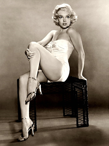
Marilyn - Now usually I'm a fan of the old pin up girls, but I think the pose here is a touch unflattering. Although the pose itself aside, everything else screams hot hot hot! I love the detail in your modelling with the arched feet to the strength in the neck. Your Betty Boop face is pure sexy.
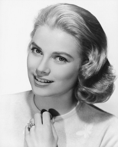
Grace - Well aren't you just the face of flawless perfection, your skin is marvelous, I love your styling and the simple relaxed smile on your face. I also love the nervousness and innocence you have with your hand playing with your top.
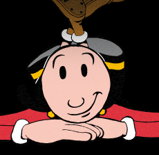
Olive - I'm torn here. I like the quirkiness of the photo, its a basic beauty, head shot with your feet dangling in the background but I'm not feeling the power of your presence. The background seems to suck you in, and the photo itself is a little small for my liking.
Janice: Marilyn, your face is a little bit dear-in-headlines, but it is the style at the time of this photograph being taken. However, your body is banging, those legs are amazing and the pose is very classy.
Grace, your smile is very endearing, and a little bit innocent too. As Morgan said, your skin and styling is flawless. You are not only showing a commercial side, but you are also selling that ring on your finger. It's a great shot.
Olive - It's a cute, quirky photo, but as Morgan says, you sort of blend in into the background, and it doesn't really stand out. The pose is not working to your advantage, especially with the black background, it makes it look like you have feet coming out of your head.
Toadette: I think you did just an okay job of showing your potential. Really, this is something we could have expected from you. I was hoping for a bit more wow factor.
Grace, I'm not convinced by your smile. It appears to be forced. It's a nice picture, but I wish it felt more genuine.
Olive, I see where you're coming from with this picture, but it's more quirky than beautiful. It's just okay for me.
Abs of Steel:
Nicholas:
Zac:
Nathan:
Morgan:Ahh! My competition for the ladies! Let's see how well you have done.
Nicholas - Well aren't you a strong, well built man. Nothing above me though. I like the simplicity of this shot and the fact that it appears to effortlessly reflect your strong aspects of a model, your height, brooding face, solid build, great bone structure. My only complaint is that the quality of the photo itself appears to be a little grainy.
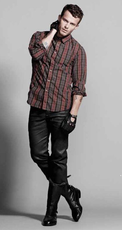
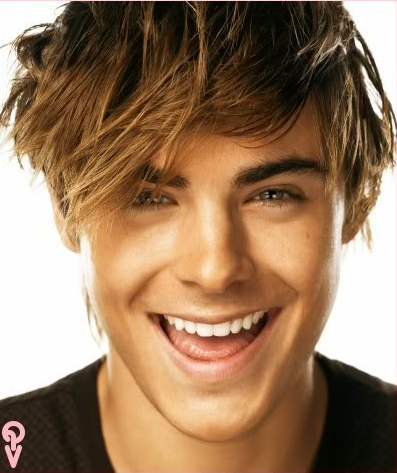
Zac - Now that's a smile! It's a great natural smile that is lighting up your entire face and your eyes. You look great, you look hot and your personality is shining through.
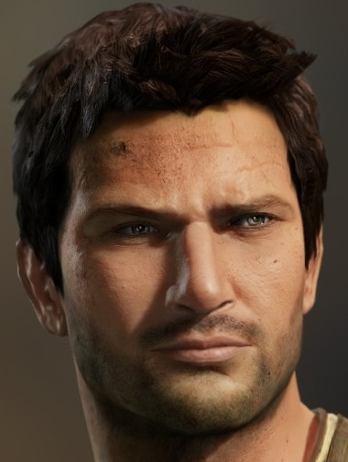
Nathan - You look real! Damn they are getting good with graphics now days. I really love the detail in this shot, the mole on your face, texture of your face, the weird thing on your forehead although this does not make your skin look too appealing. But it looks natural, the real you and you come across very comfortable and confident. Oh and those eyes!
Janice: Nicholas, your photo is not exactly on the high-fashion side, but we can definitely see that amazing potential as is the requirement of the task. Your face is very strong, and your clothes are accessorised very well.
Zac, your smile is cute, quirky and full of energy, and it catches the eye and conveys the emotion very well. Your photo could work in many different ad-based images for both men or women.
Nathan, your features are strong and masculine. Your expression is confident and sexy, and your facial hair shadow adds a little bit of sexiness.
Toadette: Nicholas, I don't see a lot of potential here. I just don't think anything about it is attention-grabbing enough. It's simple, yes, but I'm just not a huge fan.
Zac, I love that smile! So genuine and refreshing. Great job.
Nathan, you definitely look good here. It's what pretty damn close to male beauty, so good job.
Blonde Ambition:
Candice:
Madonna:
Emma:

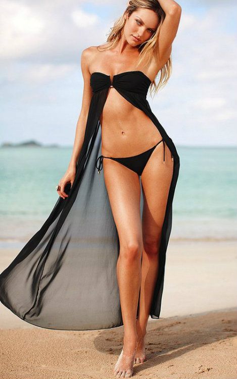
Janice: I really like this one of you, Candice. You elected to go for a swimsuit, however, you've chosen a high fashion swimsuit. From head to toe, you are selling that swimsuit amazingly. I love it.
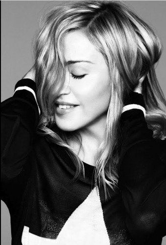
It's a very quirky photo of you Madonna. It's cute and bashful, and also a little bit fun. However, you are a little bit hidden, but nevertheless, it still works as a commercial photo, especially perhaps for a deodorant or women's sanitary product commercial.
Emma, while I love that emotion coming through the photograph, and how everything is pretty much perfection on you, I do have the qualm of it not being a real beauty shot, especially since it's around 50 pixels off not qualifying. Just remember to be careful about that.
Morgan: *drool*
Candice - You look gorgeous here, your body is pumping and it has great curves and quite a unique shape. Your face looks a tad off but nothing too drastic that I would complain about. Your swimsuit and the setting makes this a very relaxed but powerful shot.
Madonna - I really like this, your smile is adorable. It looks as if you are so caught up in yourself, and so in touch with yourself that you cant help but to smile. You look very young and fresh here as well.
Emma - You look real here! I love the emotion and unique detail in your face giving you some personality. As Janice said be careful about posting something that involves too much body for a beauty shot. The general rule that I use for a beauty shot is shoulders and above.
Toadette: Candice, I can definitely see potential in you here, so congrats. I love the setting and the high-fashion of it all. Good job this week!
Madonna, I don't really like this photo. I feel disconnected from it, and it's a little in your face. I agree with Janice that you are a little too hidden.
Emma, I think you did a great job of capturing beauty in a darker way, without taking it too far, good job!
Team Fantabulous:
Anya:

Sonam:

Kagome:

Morgan: Anya - I'm going to be Morganly honest here and say I love everything about this except the face. It looks as if your nose is out of place, and the face just looks a little dead or bored for me. Your body is smashing and I love the angle of your pose.
Sonam - I'm torn here Sonam. I like the playfulness and the laughter that I can almost hear from this photo but at the same time the time looks a little over-exaggerated and fake. I think you have stunning features but this smile shot doesn't help to showcase these photos.
Kagome - I'm liking your basic beauty, but this shot doesn't stand out for me. Perhaps something face on with some connection from the camera, I feel like a spectator and you are focused on something else. When what I want to see is you focusing on showing me your natural features. I do however like the cute bobbing of the hair with your hand.
Janice: I am going to agree 100% with Morgan here, Anya, love everything, but the face, which is a cross between old lady, and smelling something rancid.
Sonam, I love the energy! However, we need a bit of a balance between energy and keeping it pretty. You're smiling so much here, it's kind of making it a little bit ugly.
Kagome, it's beautiful, and in the moment. In fact, do you know what it reminds me of? IRL Morgan's submitted reward beauty shot. Pretty much 100%.
Toadette: Anya, I have to agree with the other judges. I do like everything but the face. I see a lot of potential in your pose and style... but the face is not good for me.
Sonam, I really like your smile here. It's genuine and fun. Good job!
Kagome, I think you just did an okay job here. It's sort of boring to me, but I like the hair flowing. Still, not bad.
Team India:
Mehreen:

Shilpa:

Pocahontas:

Janice: It's very risky going with a profile shot for your potential photo, but it's still eye-catching and interesting to look at. The traditional dress in a spin is very effective of drawing in attention, but it may be overshadowing your actual modelling. Nevertheless, it shows you know how to sell clothing.
I feel Shilpa's smile is a little bit shy, and a bit forced. There's no spark in the eyes and it brings the energy down a little bit and makes me feel a bit less happy. Remember the smile needs to show all over the face, the mouth may say one thing, but the eyes say another.
Pocahontas. Wow. This is one of the most beautiful beauty photographs I have ever seen. Those features are just perfection. This is one of my favourite pictures I've seen so far in this competition
Morgan: There's some banging girls in this team.
Mehreen - I think this is a gorgeous photo. I love the sense of movement and yet your pose is also so controlled. Your body looks deliciously long and even though it is a profile shot your strong facial features are evident.
Shilpa - You look beautiful here there is no denying that and I love the connection with the camera you are making but there is a sense of a doll-like state to you in that I'm not feeling the emotion coming from that smile.
Pocahontas - 100% agree with Janice, this is an amazing photo! Absolutely beautiful, you have an extraordinary basic beauty and I love the pure ethnicity that shines through this. Your natural stature has great modelling aspects and the artwork overall s breath taking.
Toadette:
Toadette:
Mehreen, the profile is definitely a risk, but I think it pays off in this instance. It really compliments the dress well, which is a nice high fashion piece. Good work here!
Shilpa, I like how you focused on your smile, but I wish it felt more genuine. This feels like a bit too forced for me. I wish it were more natural!
Pocahantas, this is exactly something I wanted to see for this photoshoot. Fantastic job this week!
International Beauties:
Yulia:

Katie:

Makoto:

Janice: Yulia truly is a beauty, and we can see that is your main focal point in your potential photograph. It would have been great to see your legs.
Katie's smile is beautiful and inviting. It's approachable and inviting. It's perfect for a campaign for a cosmetic product and shows your potential at being a spokesperson.
Mako, your photo isn't a beauty shot. As specified in the shoot instructions, a beauty shot is a photograph of the face. Which means only one of your five example photos is a beauty shot. I suggest trying deviantart to find better artwork, and searching under Makoto rather than Lita.
Morgan: Yulia - So hot, want to touch the hiney! This girl looks gorgeous, high class, cheeky and yet sweet. I adore the dimple in your cheek and the connection you are making with the camera. I would have liked to see the rest of your body but perhaps that's just Morgan Junior talking.
Katie - Okay I'm going to have to be honest here, this photo scares me. It looks like a before shot from a skin commercial ad or a wanted photo of a manic woman who is loose in a village. I can see that you are in fact beautiful from the alternative photos that you posted but this photo does not scream beautiful for me it just makes me scream in general.
Mako - You are very cute and I love your emerald eyes and your puffy hair, I think this photo as a close up would have been great in itself however as Janice mentioned this isn't a beauty shot.
Toadette: Yulia, I do like this. I think that your connection with the camera is strong, but I would like to see your legs. Overall, I still think you have potential here.
Katie, I don't really like this. It's just a tad too dark for smiling. Sorry!
Mako, I actually really like this photo, but feel as though I have to rank it low because it doesn't fit within the guidelines for the shot. I still do like it though! I see where your mind was at when I look at it.
Team Offbeat:
Ming:

Brent:
DNS
Penelope:
DNS
Scream Team:
Rick:

Amy:

Jack:

Janice: This is impressive. Your pose is simple, the clothes are simplistic high fashion, the photograph is an absolutely high-fashion treasure. The tattoos add an extra element to the photograph which turns it into the treasure we see now.
The quality slips here. We aren't seeing a commercial, relateable look, but a sinister and dark look. I don't know if she could pull off a commercial contract deal. I'm not too sure.
The quality slips even further, I was expecting some fan art, even showing a dark, sinister quality. However, this shows a lot of flaws, rather than hiding, or accentuating them in a way that benefits the photograph. I allowed Jack for being humanoid, don't make me regret it.
Morgan: Rick - Holy hell, this is amazing! You have an incredibly strong presence, your eyes seem to sink straight into me and the simple posture of your arm above your head looks threatening and yet modelesque at the same time. I can't wait to see more from you.
Amy - I actually really like this, I love the sinister, mysterious, sexy and imploring look you have here. Janice is right in that perhaps it's not commercial, but people may be so intimidated by your look that they may buy your product anyway.
Jack - I want to see more! This photo does seem threatening and scary but I don't see personality, it looks like a scary Christmas statue, that might move if I go close enough to it. I want to see a living, emotional being. Think outside of the box with fan art, some of the things that people come up with are truly amazing.
Toadette: Rick, I really do like this. I can see a lot of modelling potential here because of your pose and strong fashion. I like the tatts too, good work!
Amy, I get that this is in your element of what a smile would be, but I guess I am just not connecting with it. It's just a little too dark for me, but does at least "do you"
Jack, this photo is a little too dark, and I really don't get the whole beauty thing. He looks angry.
Team Testosterone:
Benjamin:

Marcus:

Superman:

Janice: Janice: Benjamin, those underwear are designer underwear. I love that you're modelling them as if they were a full suit, it sort of makes great leeway for a cheesy slogan. I love the strength in your face too.
Marcus, I would have loved to see a bigger photograph here, size is important, in the way that we can see what's going on clearly. While you do look approachable and cute, and it works.
Superman! Strong and powerful expression coupled off with a clear shot of your defined and chiseled features. It's a great picture and shows off your features flawlessly.
Morgan: More men to compete against! When will you learn that the ladies belong to me.
Ben - Let me just be the voice of what everyone else is thinking, Ben you have a big one. Okay now that is out in the open I will give you some feedback. You have a great body and I love the curvature in your torso. This actually works well for a potential shot, you have stripped yourself bare and still given us a great, strong photo. I can't really fault this at all.
Marcus - Hello baldie! Well dont you have a cute little smile and some ripping muscles. I would have liked to see a bigger photo because as Ben has shown to us 'size does matter.' I don't have much to say other than this photo is cute but it doesn't have much more than a spark than that. It's a little plain.
Superman - Sparkling goodness! Your facial features are very powerful here, this is exactly how I imagine superman to be. Your facial expression is very strong also, a great connection to the camera. I love the cape flying up around you, it looks like you are so hot that you are on fire!
Toadette:
Benjamin, I think this is great. I love the risk and concept here. Good work! I think your pose is very strong.
Marcus, this is just okay for me. I really hope that you can be a little more natural in future shots. You seem stiff! (Janice: I see what you did there....)
Superman, this is great. I love the sparkling and the accentuation of your facial features. Good work!
Team USSR:
Tyson:
Channing:
Daphne:

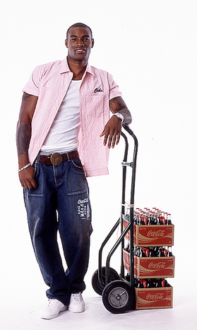
Morgan: Tyson - This is way too commercial for my liking. I want to see your potential, some effort into your posing and showing us the strong aspects of yourself. And yet in this photo my eyes drift off to the coke everytime. The good aspect of this photo is that I feel like you have a unique style and your personality appears to shine through here.
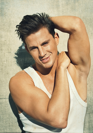
Channing - Someone is sexy and they know it! I love the simple, muscly style here and your smile is quite endearing. The squinting of the eyes takes away a lot of the energy in your face, I would have liked to see some more emotion and presence coming from you.
Daphne - You little cutie patootie. I think this is a good basic beauty shot of you, this is what I see when I think of Daphne. I like the innocence, and yet a subtle bit of mystery and quirkiness in your photo.
Janice: Janice: Tyson, as Morgan said, too small and too commercial. Plus the coke crates are way too distracting for those of us with caffeine dependency, like me and Morgan. But the size is way, way too small.
Channing, your smile is great, and sexy, however, the sun in your eyes makes them too squinty. However, as Morgan said, it's quite endearing. Just be weary of the sun.
Daphne, your photo is cute. There's a shyness and innocence, infused with mystery. However, the light is not at the best angle. It's covering up your face and hiding all your beauty.
Toadette: Tyson, I don't like this. Like the other judges said, it's too commercial and the prop is distracting. I can't see much potential here.
Channing, I do love this however. I think your smile is strong and you're coming off as warm and innocent. I do wish the sun wasn't in your eyes, but still a solid photo.
Daphne, I think this is a strong photo. I see the basic features about it, so good work!
The judges will now deliberate and when we return, we will announce who will not be continuing. (In other words, I need to step out, and results will be posted when I get back.)
Team '50s
Marilyn:

Grace:

Olive:

Morgan: Hello ladies!
Marilyn - Now usually I'm a fan of the old pin up girls, but I think the pose here is a touch unflattering. Although the pose itself aside, everything else screams hot hot hot! I love the detail in your modelling with the arched feet to the strength in the neck. Your Betty Boop face is pure sexy.
Grace - Well aren't you just the face of flawless perfection, your skin is marvelous, I love your styling and the simple relaxed smile on your face. I also love the nervousness and innocence you have with your hand playing with your top.
Olive - I'm torn here. I like the quirkiness of the photo, its a basic beauty, head shot with your feet dangling in the background but I'm not feeling the power of your presence. The background seems to suck you in, and the photo itself is a little small for my liking.
Janice: Marilyn, your face is a little bit dear-in-headlines, but it is the style at the time of this photograph being taken. However, your body is banging, those legs are amazing and the pose is very classy.
Grace, your smile is very endearing, and a little bit innocent too. As Morgan said, your skin and styling is flawless. You are not only showing a commercial side, but you are also selling that ring on your finger. It's a great shot.
Olive - It's a cute, quirky photo, but as Morgan says, you sort of blend in into the background, and it doesn't really stand out. The pose is not working to your advantage, especially with the black background, it makes it look like you have feet coming out of your head.
Toadette: I think you did just an okay job of showing your potential. Really, this is something we could have expected from you. I was hoping for a bit more wow factor.
Grace, I'm not convinced by your smile. It appears to be forced. It's a nice picture, but I wish it felt more genuine.
Olive, I see where you're coming from with this picture, but it's more quirky than beautiful. It's just okay for me.
Abs of Steel:
Nicholas:

Zac:

Nathan:

Morgan:Ahh! My competition for the ladies! Let's see how well you have done.
Nicholas - Well aren't you a strong, well built man. Nothing above me though. I like the simplicity of this shot and the fact that it appears to effortlessly reflect your strong aspects of a model, your height, brooding face, solid build, great bone structure. My only complaint is that the quality of the photo itself appears to be a little grainy.
Zac - Now that's a smile! It's a great natural smile that is lighting up your entire face and your eyes. You look great, you look hot and your personality is shining through.
Nathan - You look real! Damn they are getting good with graphics now days. I really love the detail in this shot, the mole on your face, texture of your face, the weird thing on your forehead although this does not make your skin look too appealing. But it looks natural, the real you and you come across very comfortable and confident. Oh and those eyes!
Janice: Nicholas, your photo is not exactly on the high-fashion side, but we can definitely see that amazing potential as is the requirement of the task. Your face is very strong, and your clothes are accessorised very well.
Zac, your smile is cute, quirky and full of energy, and it catches the eye and conveys the emotion very well. Your photo could work in many different ad-based images for both men or women.
Nathan, your features are strong and masculine. Your expression is confident and sexy, and your facial hair shadow adds a little bit of sexiness.
Toadette: Nicholas, I don't see a lot of potential here. I just don't think anything about it is attention-grabbing enough. It's simple, yes, but I'm just not a huge fan.
Zac, I love that smile! So genuine and refreshing. Great job.
Nathan, you definitely look good here. It's what pretty damn close to male beauty, so good job.
Blonde Ambition:
Candice:

Madonna:

Emma:

Janice: I really like this one of you, Candice. You elected to go for a swimsuit, however, you've chosen a high fashion swimsuit. From head to toe, you are selling that swimsuit amazingly. I love it.
It's a very quirky photo of you Madonna. It's cute and bashful, and also a little bit fun. However, you are a little bit hidden, but nevertheless, it still works as a commercial photo, especially perhaps for a deodorant or women's sanitary product commercial.
Emma, while I love that emotion coming through the photograph, and how everything is pretty much perfection on you, I do have the qualm of it not being a real beauty shot, especially since it's around 50 pixels off not qualifying. Just remember to be careful about that.
Morgan: *drool*
Candice - You look gorgeous here, your body is pumping and it has great curves and quite a unique shape. Your face looks a tad off but nothing too drastic that I would complain about. Your swimsuit and the setting makes this a very relaxed but powerful shot.
Madonna - I really like this, your smile is adorable. It looks as if you are so caught up in yourself, and so in touch with yourself that you cant help but to smile. You look very young and fresh here as well.
Emma - You look real here! I love the emotion and unique detail in your face giving you some personality. As Janice said be careful about posting something that involves too much body for a beauty shot. The general rule that I use for a beauty shot is shoulders and above.
Toadette: Candice, I can definitely see potential in you here, so congrats. I love the setting and the high-fashion of it all. Good job this week!
Madonna, I don't really like this photo. I feel disconnected from it, and it's a little in your face. I agree with Janice that you are a little too hidden.
Emma, I think you did a great job of capturing beauty in a darker way, without taking it too far, good job!
Team Fantabulous:
Anya:

Sonam:

Kagome:

Morgan: Anya - I'm going to be Morganly honest here and say I love everything about this except the face. It looks as if your nose is out of place, and the face just looks a little dead or bored for me. Your body is smashing and I love the angle of your pose.
Sonam - I'm torn here Sonam. I like the playfulness and the laughter that I can almost hear from this photo but at the same time the time looks a little over-exaggerated and fake. I think you have stunning features but this smile shot doesn't help to showcase these photos.
Kagome - I'm liking your basic beauty, but this shot doesn't stand out for me. Perhaps something face on with some connection from the camera, I feel like a spectator and you are focused on something else. When what I want to see is you focusing on showing me your natural features. I do however like the cute bobbing of the hair with your hand.
Janice: I am going to agree 100% with Morgan here, Anya, love everything, but the face, which is a cross between old lady, and smelling something rancid.
Sonam, I love the energy! However, we need a bit of a balance between energy and keeping it pretty. You're smiling so much here, it's kind of making it a little bit ugly.
Kagome, it's beautiful, and in the moment. In fact, do you know what it reminds me of? IRL Morgan's submitted reward beauty shot. Pretty much 100%.
Toadette: Anya, I have to agree with the other judges. I do like everything but the face. I see a lot of potential in your pose and style... but the face is not good for me.
Sonam, I really like your smile here. It's genuine and fun. Good job!
Kagome, I think you just did an okay job here. It's sort of boring to me, but I like the hair flowing. Still, not bad.
Team India:
Mehreen:

Shilpa:

Pocahontas:

Janice: It's very risky going with a profile shot for your potential photo, but it's still eye-catching and interesting to look at. The traditional dress in a spin is very effective of drawing in attention, but it may be overshadowing your actual modelling. Nevertheless, it shows you know how to sell clothing.
I feel Shilpa's smile is a little bit shy, and a bit forced. There's no spark in the eyes and it brings the energy down a little bit and makes me feel a bit less happy. Remember the smile needs to show all over the face, the mouth may say one thing, but the eyes say another.
Pocahontas. Wow. This is one of the most beautiful beauty photographs I have ever seen. Those features are just perfection. This is one of my favourite pictures I've seen so far in this competition
Morgan: There's some banging girls in this team.
Mehreen - I think this is a gorgeous photo. I love the sense of movement and yet your pose is also so controlled. Your body looks deliciously long and even though it is a profile shot your strong facial features are evident.
Shilpa - You look beautiful here there is no denying that and I love the connection with the camera you are making but there is a sense of a doll-like state to you in that I'm not feeling the emotion coming from that smile.
Pocahontas - 100% agree with Janice, this is an amazing photo! Absolutely beautiful, you have an extraordinary basic beauty and I love the pure ethnicity that shines through this. Your natural stature has great modelling aspects and the artwork overall s breath taking.
Toadette:
Toadette:
Mehreen, the profile is definitely a risk, but I think it pays off in this instance. It really compliments the dress well, which is a nice high fashion piece. Good work here!
Shilpa, I like how you focused on your smile, but I wish it felt more genuine. This feels like a bit too forced for me. I wish it were more natural!
Pocahantas, this is exactly something I wanted to see for this photoshoot. Fantastic job this week!
International Beauties:
Yulia:

Katie:

Makoto:

Janice: Yulia truly is a beauty, and we can see that is your main focal point in your potential photograph. It would have been great to see your legs.
Katie's smile is beautiful and inviting. It's approachable and inviting. It's perfect for a campaign for a cosmetic product and shows your potential at being a spokesperson.
Mako, your photo isn't a beauty shot. As specified in the shoot instructions, a beauty shot is a photograph of the face. Which means only one of your five example photos is a beauty shot. I suggest trying deviantart to find better artwork, and searching under Makoto rather than Lita.
Morgan: Yulia - So hot, want to touch the hiney! This girl looks gorgeous, high class, cheeky and yet sweet. I adore the dimple in your cheek and the connection you are making with the camera. I would have liked to see the rest of your body but perhaps that's just Morgan Junior talking.
Katie - Okay I'm going to have to be honest here, this photo scares me. It looks like a before shot from a skin commercial ad or a wanted photo of a manic woman who is loose in a village. I can see that you are in fact beautiful from the alternative photos that you posted but this photo does not scream beautiful for me it just makes me scream in general.
Mako - You are very cute and I love your emerald eyes and your puffy hair, I think this photo as a close up would have been great in itself however as Janice mentioned this isn't a beauty shot.
Toadette: Yulia, I do like this. I think that your connection with the camera is strong, but I would like to see your legs. Overall, I still think you have potential here.
Katie, I don't really like this. It's just a tad too dark for smiling. Sorry!
Mako, I actually really like this photo, but feel as though I have to rank it low because it doesn't fit within the guidelines for the shot. I still do like it though! I see where your mind was at when I look at it.
Team Offbeat:
Ming:

Brent:
DNS
Penelope:
DNS
Scream Team:
Rick:

Amy:

Jack:

Janice: This is impressive. Your pose is simple, the clothes are simplistic high fashion, the photograph is an absolutely high-fashion treasure. The tattoos add an extra element to the photograph which turns it into the treasure we see now.
The quality slips here. We aren't seeing a commercial, relateable look, but a sinister and dark look. I don't know if she could pull off a commercial contract deal. I'm not too sure.
The quality slips even further, I was expecting some fan art, even showing a dark, sinister quality. However, this shows a lot of flaws, rather than hiding, or accentuating them in a way that benefits the photograph. I allowed Jack for being humanoid, don't make me regret it.
Morgan: Rick - Holy hell, this is amazing! You have an incredibly strong presence, your eyes seem to sink straight into me and the simple posture of your arm above your head looks threatening and yet modelesque at the same time. I can't wait to see more from you.
Amy - I actually really like this, I love the sinister, mysterious, sexy and imploring look you have here. Janice is right in that perhaps it's not commercial, but people may be so intimidated by your look that they may buy your product anyway.
Jack - I want to see more! This photo does seem threatening and scary but I don't see personality, it looks like a scary Christmas statue, that might move if I go close enough to it. I want to see a living, emotional being. Think outside of the box with fan art, some of the things that people come up with are truly amazing.
Toadette: Rick, I really do like this. I can see a lot of modelling potential here because of your pose and strong fashion. I like the tatts too, good work!
Amy, I get that this is in your element of what a smile would be, but I guess I am just not connecting with it. It's just a little too dark for me, but does at least "do you"
Jack, this photo is a little too dark, and I really don't get the whole beauty thing. He looks angry.
Team Testosterone:
Benjamin:

Marcus:

Superman:

Janice: Janice: Benjamin, those underwear are designer underwear. I love that you're modelling them as if they were a full suit, it sort of makes great leeway for a cheesy slogan. I love the strength in your face too.
Marcus, I would have loved to see a bigger photograph here, size is important, in the way that we can see what's going on clearly. While you do look approachable and cute, and it works.
Superman! Strong and powerful expression coupled off with a clear shot of your defined and chiseled features. It's a great picture and shows off your features flawlessly.
Morgan: More men to compete against! When will you learn that the ladies belong to me.
Ben - Let me just be the voice of what everyone else is thinking, Ben you have a big one. Okay now that is out in the open I will give you some feedback. You have a great body and I love the curvature in your torso. This actually works well for a potential shot, you have stripped yourself bare and still given us a great, strong photo. I can't really fault this at all.
Marcus - Hello baldie! Well dont you have a cute little smile and some ripping muscles. I would have liked to see a bigger photo because as Ben has shown to us 'size does matter.' I don't have much to say other than this photo is cute but it doesn't have much more than a spark than that. It's a little plain.
Superman - Sparkling goodness! Your facial features are very powerful here, this is exactly how I imagine superman to be. Your facial expression is very strong also, a great connection to the camera. I love the cape flying up around you, it looks like you are so hot that you are on fire!
Toadette:
Benjamin, I think this is great. I love the risk and concept here. Good work! I think your pose is very strong.
Marcus, this is just okay for me. I really hope that you can be a little more natural in future shots. You seem stiff! (Janice: I see what you did there....)
Superman, this is great. I love the sparkling and the accentuation of your facial features. Good work!
Team USSR:
Tyson:

Channing:

Daphne:

Morgan: Tyson - This is way too commercial for my liking. I want to see your potential, some effort into your posing and showing us the strong aspects of yourself. And yet in this photo my eyes drift off to the coke everytime. The good aspect of this photo is that I feel like you have a unique style and your personality appears to shine through here.
Channing - Someone is sexy and they know it! I love the simple, muscly style here and your smile is quite endearing. The squinting of the eyes takes away a lot of the energy in your face, I would have liked to see some more emotion and presence coming from you.
Daphne - You little cutie patootie. I think this is a good basic beauty shot of you, this is what I see when I think of Daphne. I like the innocence, and yet a subtle bit of mystery and quirkiness in your photo.
Janice: Janice: Tyson, as Morgan said, too small and too commercial. Plus the coke crates are way too distracting for those of us with caffeine dependency, like me and Morgan.
 But the size is way, way too small.
Channing, your smile is great, and sexy, however, the sun in your eyes makes them too squinty. However, as Morgan said, it's quite endearing. Just be weary of the sun.
Daphne, your photo is cute. There's a shyness and innocence, infused with mystery. However, the light is not at the best angle. It's covering up your face and hiding all your beauty.
Toadette: Tyson, I don't like this. Like the other judges said, it's too commercial and the prop is distracting. I can't see much potential here.
Channing, I do love this however. I think your smile is strong and you're coming off as warm and innocent. I do wish the sun wasn't in your eyes, but still a solid photo.
Daphne, I think this is a strong photo. I see the basic features about it, so good work!
The judges will now deliberate and when we return, we will announce who will not be continuing. (In other words, I need to step out, and results will be posted when I get back.)


